
 do-it-yourself graphics (2nd edition, © 2012 D.L.Keur)
How to do your own...which is what most of you want to know.
First, you need at least one good graphics program, preferably several, but I won't get into that right now. For those who don't want to spend the money to buy something like, say, Adobe Creative Suite, Gimp is a very good program and is absolutely free. Some people claim it is even better than Adobe, and, ultimately, I think you'll be very happy with it. You can get it here: http://www.gimp.org/.
GRAPHIC ART PROJECT SET UP — THE BARE BASICS
Always start with the assumption that, sooner or later, you might have to print the project on paper, yes, even if you are just creating something for use on the Net.
Really. I'm very serious, here. There's nothing worse than having to recreate a piece of artwork because you created it at 72 or 96 ppi.
SO WHAT IS DPI/PPI & WHY DOES IT MATTER?
Dots per inch refer to physically printing on real world media...like paper...like you do at home on your inkjet or office laser printer. Simplifying it, it's how many dots of ink are used within an inch. Because we use electronic interfaces now to create our printable files, DPI (dots per inch) are actually PPI (pixels per inch). Traditionally, it's called DPI, but, today, the two mean the same thing for practical purposes. PPI really doesn't mean a whole lot on your monitor, and some art programs don't let you adjust DPI/PPI. So, you have to—have to—set up your work so that its width and height will print at the appropriate size at the finest DPI/PPI you intend to have it printed. The higher the dpi/ppi you plan to print at, the larger your image file must be in pixels wide by pixels high.
For 300dpi, which is a pretty standard print quality (as opposed to high or premium) quality print, to set up a full bleed 8.5" x 11" trim size page with an 1/8th inch bleed (file size: 8.75"x11.25"), that would translate in pixel width and height to 2625px x 3375px. For the same sized page, if it is to be printed at 600dpi, the file will have to measure twice that, or 5250px x 6750px. For big poster sizes and signage, printers can get away with 150dpi, so your 300dpi file will print okay to about 17" x 22".
Clear as mud?
Okay, think of it this way: 1 inch of printable file at 300dpi is equal to 300x300 pixels. 1 inch of printable file at 600dpi is equal to 600x600pixels, and 1 inch of printable file at 150dpi is equal to 150x150 pixels.
Take the number of inches and partial inches (in decimal equivalent) you need, including adding on an eighth inch of bleed all the way around if doing a full bleed print job, and MULTIPLY that by the dpi/ppi number you're going to want it printed at. (Usually 300dpi is good enough, except for the higher end projects.)
EXAMPLE: For a 6" x 9" book cover (back cover, spine, and front cover) with a 1" spine that is full bleed (add that 1/8" bleed all the way around), you will need a file size width and height of: 13.25" x 9.25". To print it at 300dpi, which is standard for CreateSpace and LSI, you will multiply 13.25" x 300ppi and 9.25 x 300ppi.
13.25" x 300ppi = 3975 pixels wide
9.25" x 300ppi = 2775 pixels high
So, when setting up your file, set the width to 3975 pixels and the height to 2775 pixels. If the program has a dpi/ppi setting, set that to 300. If you are setting up in inches (or centimeters), you MUST set the DPI to 300, or else suffer a small file that won't print well at all.
Does this make sense now? Maybe? A bit? ...Trust me. Just multiply the size in inches by the dpi/ppi you desire in quality, usually 300. And don't forget the bleed.
WHAT THE HECK IS BLEED? AND WHILE WE'RE AT IT, WHAT THE HECK IS TRIM SIZE?
Full bleed means that there is no margin around the artwork, that the artword goes from edge to edge, covering all of the available surface of the media (paper, cover stock, canvas....). When a printer prints a file that requires the artwork to go all the way to the edge, an additional 1/8 inch of extra artwork is needed all the way around so that, when the artwork is cut to its proper size, all the paper is covered, leaving no unprinted paper showing. So a full bleed art project requires the artwork to bleed over the TRIM SIZE, TRIM SIZE being the actual final size of the end product, like, say, for a book cover or a poster or a CD cover.
BUT, YOU SAY, YOU ONLY WANT TO MAKE AN ILLUSTRATION FOR YOUR WEBSITE. YOU'LL NEVER, EVER WANT TO PRINT IT!
Okay. Don't say I didn't warn you.
If you are very sure you'll never, ever want to print the artwork and will only use it on your website, then you can get away with creating it at the size you actually want to display, say a 300x254 block of pixels. In that case, just make your file 300x254 pixels. If your program wants a dpi setting, use 72 dpi/ppi or 96 dpi/ppi. But, just so you know, this is what will happen if you later try to print that file to paper:
Here's a 300x254 pixel web compressed JPG image that's set at 72dpi, typical for use on a website:

Nice colors, good clarity, right?
Now, if you try to print it at 300dpi, it comes out on paper about this size:

And if you try to force it to print at the size it looks like on the website, here's what happens to the image quality in most instances where special software isn't utilized:
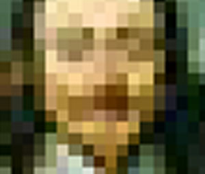
(Note that this is just a small snip of the picture at the size it needs to be to print on paper at the same size it is on the web.) What it approximately looks like once printed would be this:
Even with special software, the image will come out less than optimum for printing:

Notice the color distortion and lack of clarity? It's blotchy and the nice detail is lost, right?
...Just so you know. =)
NOW LET'S TALK ABOUT COLOR, BUT, AGAIN, JUST SOME BARE BASICS:
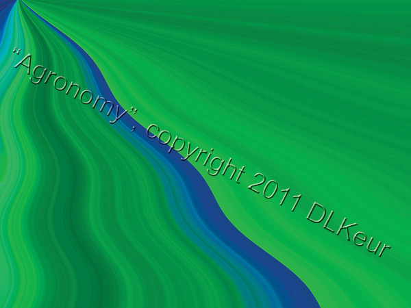
If you are creating a color image, you are probably going to create your file using RGB (Red-Green-Blue), which is fine for viewing on electronic media. For print, however, the colors of the inks are not RGB, but CMYK or CcMmYK (C=-Cyan, c=light cyan, M=Magenta, m=light magenta, Y=Yellow, K=Key). If you don't "proof" your artwork and check the "gamut", when you convert RGB to CMYK, you're going to get a huge shock. Here's an visual example using one of my fine art prints called "Agronomy" that I have artificially colored for this discussion.
Here's an RGB version:
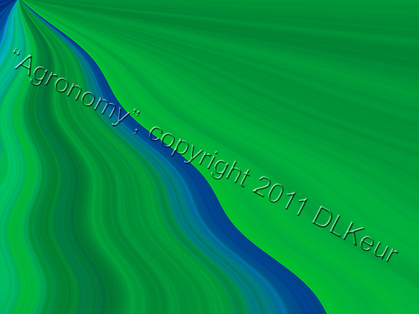
Here's what happens when I check the gamut.
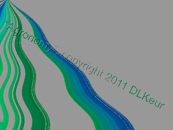
All the gray areas you see are colors which won't print correctly. What will print instead if we don't do something to adjust the colors is this:
As you can see if you have your monitor color-calibrated correctly (also a must for working on art on a computer), the colors are a lot duller, and the image loses its dramatic edge.
So, be careful when you are creating an image for traditional print media using RGB color mode on your computer. What can result will be less than what you anticipated. Also, be aware of the fact that, to save money, a lot of print-on-demand companies don't use the 300 inks level that is pretty standard. And they will often reduce the percentages of the costlier inks, also to save on cost. LSI is an example, and you can really wind up with a dull, listless end result.
How to avoid that problem, of course, is to start your image in CMYK, but doing that often will limit the number of effects and filters you can apply. Instead, make sure you proof your colors and check your gamut often.
A NOTE FOR BOOK COVERS: You might consider starting with an ink limit of 240 inks instead of the industry standard of 300 inks. Go to your color profile settings to do that before starting work.
This page was created June 2012, uploaded November 1, 2012, and replaces this page.